
Legal product reviews and business guidance from industry experts.
Chapter 2/6
Law Firm Website Design Principles
Law Firm Website Design
5 min read
Legal product reviews and business guidance from industry experts.
Chapter 2/6
Law Firm Website Design
5 min read
You know first impressions are important. In the online world, it takes someone 50 milliseconds to form an opinion about your website based on what they see. It’s simple: your site needs to look great.
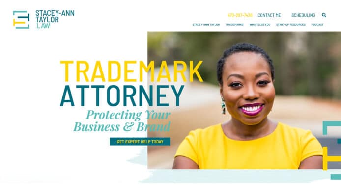
Beautiful law firm web design goes a long way. For example, check out one homepage from our 2022 Best Law Firm Website Contest winners to see what we mean. The yellow on Stacey-Ann Taylor Law’s page POPs! The page has a very clean, sleek feel.
We’ll cover more details on making a jaw-dropping site in a second. First, let’s cover the basic pages every firm needs.
To fulfill the purpose of communicating your unique value proposition and providing information about your firm and your services, there are a few basic pages you must have on your website.
These pages include:
Home. This page is probably the first place your visitors will land. It’s the best place to capture your audience’s attention and make a great first impression.
About. The About page should communicate your vision, values, and the story of your firm. This is a great place to show what makes you unique from other law firms in your practice area.
Bio. The Bio page is about you, why you do what you do, who you do it for, and how you help your clients specifically. Make this interesting and read like a story. Remember: you’re writing this for potential clients, so consider what they will think is important.
Services. The Services page is all about the services you deliver and how they benefit your clients.
Contact. One of the most important pages on your website, the Contact page, gives your visitors the chance to reach out to you for more information.
Law firm website design refers to the aesthetics of a website or the visual aspects involved in website creation. It includes the creation of the overall layout from images to text. Believe it or not, law firm website design can make or break your online presence.
To make a great first impression using your website design, it’s critical to follow a few law firm website design principles.
All the design features on your website should serve a purpose. A cluttered design makes it difficult to consume your content. Don’t leave your audience searching through piles of graphics and visual elements. Keep your design simple.
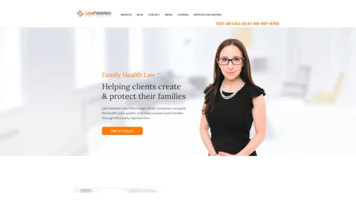
In the example below, Family Health Law does an excellent job showcasing how to create a robust and dynamic website. Lisa’s photo and vision are front and center with a clear CTA as soon as the homepage loads. Through a few scrolls, you can easily see Lisa’s services, intended clients, and career journey.
Images draw people in (who wants to read a bunch of boring text?). An image can tell a story in an instant. They can trigger emotions or memories. They can keep your site from being boring. Background images can create an atmosphere or give a visitor an immediate impression of what your site is about.
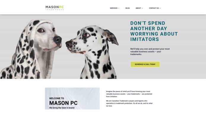
We love the way Mason PC’s site cleverly uses a picture of super-cute dogs to show why you need to protect your brand.
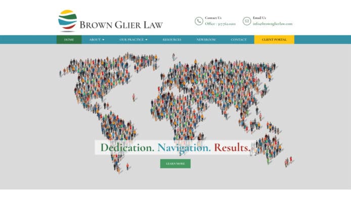
The image on Brown Glier Law’s website tells you immediately what they do.
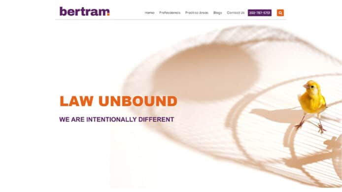
Bertram’s site is clever with showing their motto through the image of a yellow bird outside its cage right as you enter their homepage. It is not only a fun conversation starter, but an image that visitors will easily remember. Their playful and fun colors also contribute to their overall vision and motto of being a different kind of law firm.
We’ve said it before, and we’ll say it again: create easy to follow navigation and place it near the top of your website. This helps your audience find what they’re looking for quickly.
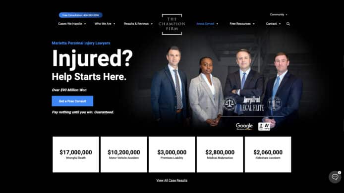
Here, The Champion Firm keeps their logo in the center with easy to read and follow links at the top of the page.
Most users follow and “F” pattern when reading content online. This means they read the top of the page first, down the left-side and then across the page again. Anything you want your audience to notice first should be in the top right-hand side of your page (such as your logo). The rest of your elements should follow the pattern.
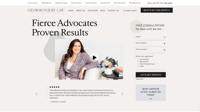
In the below example, Gilormo Injury Law takes advantage of this by putting the “Free Consultation” form and “What’s My Case Worth” both in the upper right corner of the page.
Use plenty of whitespace and spread visual elements out across the page. Use headings in your text and easy-to-read typography. Use good font sizes. A 16 px font is best for main body text.
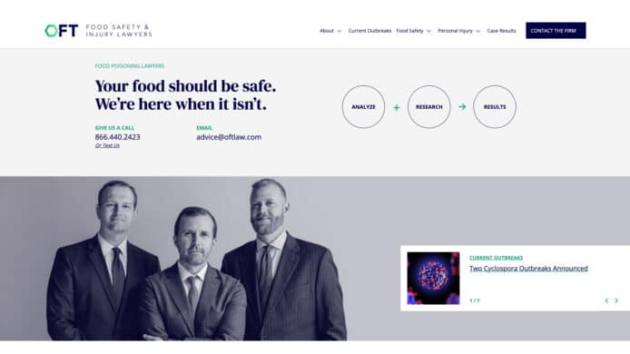
Check out the site for OFT Law. They are a food poisoning law firm focused on handling food injury cases nationwide. This solid example of how to do a good job marketing a highly specialized niche practice. While it has clean, simple graphics & photos for the front page, the site also leans heavily on promoting the firm’s expertise.
Stay on Brand with Your Website Design
Your website design should communicate your brand. Use your brand colors and your logo. Create images and elements that are consistent with your message. We recommend creating a brand style guide to use for designing your website and any future content.
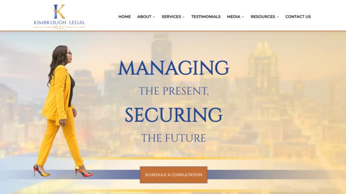
This website for solo practitioner Tycha Kimbrough is a terrific example of how to brand yourself through clean design and good content marketing. Through Tycha’s high-quality images and background, it’s easy to get a sense of what it would be like to work with her. Highlighting the attributes of one individual is key for a solo attorney and this site makes Kimbrough seem approachable while emphasizing her background and expertise.
We hope these examples inspire you to go beyond gavels, columns, and thick, leather-bound books on your site. Lawyers can be creative and visually appealing, too!
Download the Full Guide to Law Firm Website Design
With this guide, you’ll have the tools to create strategic goals for your site. You’ll get web design basics and ways to enhance your content to attract and convert potential clients, driving more of the right traffic to your website.
